Design of the Day : (1)
Well I've used a lot of technique in this particular design. And it took me..Um.. I can't remember the elapsed time I used to complete it. But I can roughly guess it took me about 2 hours and a half. Yeah, pretty much so.
I thought of making it a bit like a typographic kind of design. That explains the way it looks like. I know, it seems simple to be done, but typography is one of the branch of graphic design that require enormous creativity (well, as if creativity can be quantified, LOL). So, this is it, feel free to leave comments and critics.
Click The Image to enlarge =)
Read More! More!
Wazzup !
Hey hey. It's me again. It has been so much a while right? Well seems so.
Damn ! I really need to work on this blog. I need to put up something quite good for this blog. It's just that I don't really know what kind of tutorial I should do. And the fact that writing a tutorial is so freaking hard and time-consuming. Besides, as far as i know, a lot of people don't even have Adobe Photoshop installed on their computer ! How ironic. That explains why this blog seems to be haunted.
Well, speaking of Adobe Photoshop, did you guys hear? That Adobe is currently going to release a new version of Adobe Photoshop - the CS5. Cool !
I mean not that cool. At least try to collect a lot more new features long enough for people to get bored with previous version, Photoshop CS4. It has been only a year before they decided to release a new one.
Though the new CS5 will offer with a lot more better features, but still, it seems like they are trying to gain as much profit as possible. Capitalism. Sigh..
Read More! More!
The Stroke
Stroke is often used to give emphasize on an image, to create border that separate the image and the other images or background, or anything according to your creativity.
So, lets get started.
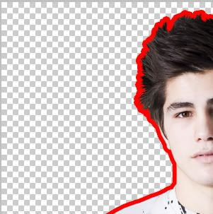
This is what we want to do. An outline of an image. With your creativity, you can manipulate this technique into a masterpiece. Stroke is one of the most important element in LINEART

There are two ways of doing this.
1st
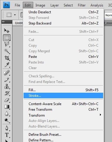
Go to edit> stroke. Set the colour of the stroke and it's thickness. Click OK. Make sure the image that you want to stroke with is rasterize first. Tom do this, click layer>rasterize.

2nd
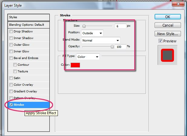
You can also stroke by clicking the layer style option. Go to layer > layer style or, just click twice on the layer and a window will pop out.
Check the stroke effect, and start playing around with the setting.

Good Luck !
Read More! More!
Quiet and Clean
Now, as you all can see, this blog is so.. quiet. And it is kind of tensing isn't it? Well at least I feel so.
So, I've been thinking, why dont you all leave comments on whatever you want to know. And I'd be pleased to write a tutorial about it, allright?
Read More! More!
Teaser text for testing read more capability
Yup, it's perfectly working.
You know, one of the things that ppl hate in blogger is that, they don't have the "Read More..." stuffs in the content post.
What the duck..
So anyway, I finally came up with the hack to put the "Read More..." things in the content post. You can see it as Bace La Lagi. It's the Malay for Read More.
Allright, that's it.
Have a good day, Lads !
Read More! More!
Simple and Executive text tutorial
Ok, here we go with our first tutorial,

First, you run your adobe Photoshop .
Then, create a new file and name it as you like. Make the size to be 400x400 pixels should be ok, and dont forget to turn the background setting to transparent. You'll make work much easier. I'm just gonna put "My name" as the name of my file.
Fill the first layer with the colour you like. I'm just gonna have this lovely purple. To do that, go to edit > fill. or shift+f5. its that simple.
there you go.
Next, go to blending option of this first layer. Go to the bottom side of the screen, and you'll find a tiny "fx" icon under the layers space above. And click it, and go to blending option.
Now click on the white-black gradient bar, and you'll see some options there. And among those colourful options of gradients you have there, click the second one, which as you can see showing the black to transparent gradient. Choose on that one and set the settings as below.
Simply click OK.
After that, make a new layer by clicking that tiny button at the bottom side.
Then, you select the gradient tool, and ensure that you set the foreground layer as white and the background layer black. if you're not, click "D" and "X" button to change them.
Then you click on the gradient bar on top side of the screen, and choose white to transparent. Make sure you've changed the gradient setting to radial , not linear. Check on the right side of the gradient bar. It must be the second one to be selected, not the first. Picture below shows the first, then change to the adjacent one.
Then drag the gradient across the canvas. Simple rules in photoshop, "Don't forget to play around with things" . You'll find out what suits best with yourself.
Then you set the blending type to soft light, and reduce the opacity to 50%.
Allright, now grab the type tool, at the tool palette at the leftest side of your screen, and drag it to create a space for you to write something. Now write anything that you want. I'll have this core word. That's fine with me.
Make sure you use plain white color. And use whatever fonts that suit you, but I'll stick with Arial, with Black set up. I want it to be highlighting, and space consuming, thus Black is the best. Not bold, or italic, or normal.
And make it at the center. This is essential to make an executive look, because balance, and simplicity is the key. Now this sounds like a professional.
Now change the blending options, or the layer style of your text layer and check the inner shadow. Set the settings like mine. But, it's optional, you can play around with your settings.
Now, reduce the text's layer's Fill to about 63%.
After that, don't forget to save your file into any file you want. But if you want to upload it somehere like facebook, then save it as jpeg file. You can also save your file as .psd for future alteration or something.
And now, voila !
Why don't you share what your work's like in your facebook wall ? Come on, show me what you got !
Good Luck !
Read More! More!
Getting Ready
Now, my friends, in the process of gathering knowledge, you just have to be prepared. You can't just go into a hall or something and peep into what was being held in it.
To be ready my friend, I need you to have Adobe Photoshop as the most basic part of it. The newer version the better.
Allright, I'm going to bring you into a closer look into each and every tool inside Photoshop itself. So be with me always, because I dont want you to miss anything throughout our lessons.
When you finds out that you're getting easy with the tools, you can play around with them and start sparking some experience.
Good Luck.
Read More! More!


